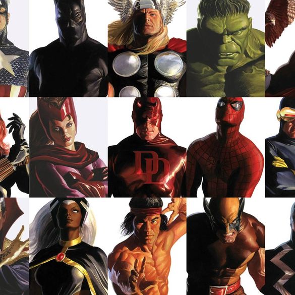
These are an Alex Ross take on many of Marvel's most classic comic characters, and over the course of about five weeks will appear on the cover of comic issues related to that specific character.
It is a brilliant marketing move and the art is truly outstanding. I personally took advantage of a local LCS deal and ordered one of each for a $99.99 price tag, taking about 15% off of the cover price.
But as we tend to do with literally everything in our lives, some began to stand out to me as favorites. Surely you have your preferred covers as well. I thought the only reasonable and logical thing to do is subjectively rank them and throw those thoughts into a blog. Rankings blogs are great click-bait anyways. Win-win.
What follows is Part 1 of ranking all 32 covers from best to worst. Tune in over the next few days for Part 2.
Alex Ross Covers: Just, Why? (32-29)
 32. Medusa
I'm from Texas so I've seen my fair share of big hair, but this is getting a little ridiculous. I know, I know, the big hair is her thing. But why do we even have Medusa over the likes of someone like Punisher or Luke Cage? They don't have regular issues running right now? That's the kind of crap you can work out.
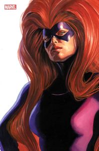
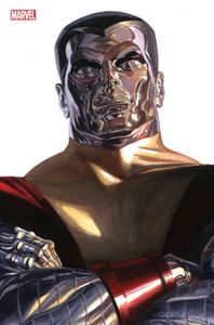
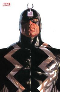 31. Black Bolt
Another one I have to question why he is even on this list. Were Iron Fist or Ant-Man not available to sit for a portrait? Plus, when you look at this one next to Captain America, they look like twin brothers. Did Steve Rogers just throw on the Black Bolt suit for this one? I personally find it rather Inhuman that he is included. Get it... Inhuman?
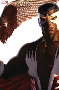 30. Falcon
I don't need an actual falcon in the picture to remind me that this is Falcon. Show, don't tell, you know? I am aware that his backstory is that of a bird trainer, but having an animal in the picture just takes away from the "Timeless" image of Falcon. For me. But the nod to the old costume is certainly appreciated.
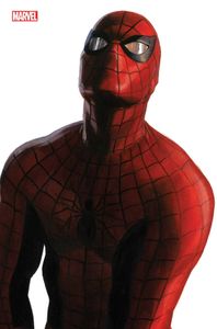 29. Spider-Man
It pains me to put one of the OGs down this far, but it just seems like if you could see his bottom half, he would be holding himself like a toddler who has to pee. Nothing stands out about this one to me. The Doc-Brown-in-Back-To-The-Future-II reflective eye pieces don't do it for me either.
Alex Ross Covers: Something Looks Off (28-25)
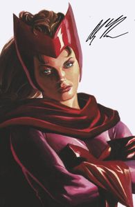 28. Scarlet Witch
I was hoping for something a little more menacing than the "Why am I here?" look we got from Wanda on this cover. And in what will be a theme going forward, almost 25% of these covers have characters with their arms crossed. As we will see later on this list and in Part 2, there are ways for them to do something more creative than just arms straight or crossed arms.
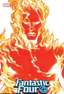 27. Human Torch
One of the things that impressed me the most about these covers is the realism expressed in the art. I mean, it sometimes looks like Ross took a human subject and made them the model of the cover. Not the case with Human Torch, however. Of all 32 options, this one is the one that looks the most "comic" to me; the most cartoonish. In the comic books, that doesn't bother me one bit, but it seems like he was going for something else here.
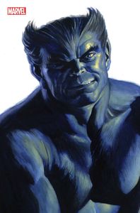 26. Beast
Beast looks like he is sitting for his senior class yearbook picture and he's not thrilled that his mom made him comb his hair. That expression is something else. Do better, Marvel.
 25. Colossus
When I compare this silver classic to Silver Surfer (who will assuredly appear in Part 2 when I rank the top half), Colossus leaves something to be desired. It pains me because of how much I love Colossus, but I was hoping for a little more facial expression in Colossus' face. On this cover, he just looks like the T-1000 forming back into shape.
Alex Ross Covers: Just Missed It (24-21)
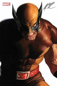 24. Wolverine
Logan certainly looks like a bad-ass in this one and it is a good example of how not every one of these needs to be a stoic portrait suitable for the White House. But this cover strikes me as a swing and a miss compared to the potential available with the character. I am not a fan of the costume choice, and think for a timeless cover, they should have gone with the yellow and blue fang costume. The Timeless covers that have a lot of color really pop on the shelf and I think that could have helped this one. And don't you have to have the claws in the picture? Somehow?
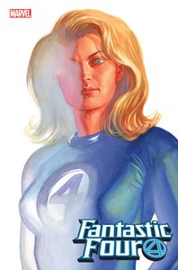 23. Invisible Girl
I don't quite know what to do about this, and I'm certainly no artist and respect how difficult it must be, but it just seems like we have an incomplete painting here instead of someone who is transforming into invisibility. Perhaps because of it, this is the cover where it looks like the least amount of detail and time was spent on the face.
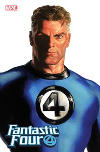 22. Mr. Fantastic
Of course these two would be joined together in the ranks just as they are in life. I do like the presidential pose of some of these classic heroes like Reed Richards, Thor, and Captain America, but his particular one makes Richards look less like superhero founding father and more like Reed Richards who is about to deliver the sports report on your local newscast. I also think if we see the rest of his body this is someone with a 40-inch chest and a 28-inch waist. There's a lot of narrowing happening down there.
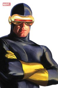 21. Cyclops
This is one instance where I think the updated costume works better than the original. However, points deducted for arms crossed and not having his finger on the eye blaster like he's ready to fire. I also felt - while most of Ross' shadowing and shading is phenomenal - the two-tone cowl just made him look more Two-Face than anything else. Check it out. You can't un-see it.
Alex Ross Covers: Better Versions Ahead (20-17)
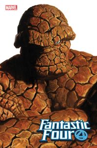 20. Thing
We are getting to the point where it's certainly nitpicking to come up with reasons why these aren't in the top half, but this all comes down to an anatomical arm-crossing issue for me. I just don't think a large, bulky creature made of rock can just cross his arms like that. This one screams out to me that it needs some action in the portrait, but instead we get a whole bunch of Thing rock-cleavage.
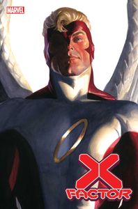 19. Angel
This character is in the running for having some of the more interesting costumes throughout X-Men and Marvel history, so why Ross chose this one is a mystery to me. I think where I stand here is that we needed at least one of the original X-Men to be in the classic X-Men #1 costume, and Angel would have been the most rewarding.
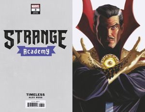 18. Dr. Strange
Credit for not crossing his arms in the picture, for sure. I actually think this is a strong representation of what Stephen Strange would look like, but the red collars of the costume distract me somewhat. It's a necessary part of the costume to include, unfortunately, but enough of an eyesore to knock him out of the top half of the list.
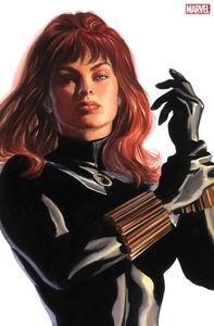 17. Black Widow
There really isn't too much to complain about here, but someone had to be the last cut. Perhaps it's the Molly Ringwald-Pretty In Pink hair that's holding me back from a higher spot? In the end, this is a great way to showcase someone with a monochromatic suit absent of color or detail.
What Does the Top 16 Look Like?
Tune in next week as I will unveil the top 16 Alex Ross Timeless covers. Some of this next group I already have multiple copies in my collection, as I think the representation is spot on. We will, of course, have more arms crossed, but also some very interesting elements and action in the covers that bump them to the top of the ranks.
How do you feel about this list? Who should have been in this list that didn't make it? Let me know in the comments!