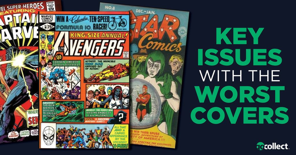
All-Star Comics #8: 1st Appearance of Wonder Woman
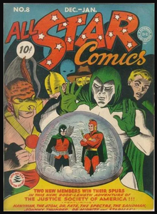
This cover is arguably the greatest offender of them all! Easily one of the greatest superheroes of all time, and a member of DC's "trinity," Wonder Woman deserved a much better debut than the one she received in All-Star Comics #8 way back in December of 1941. Not only does she not appear on the cover of this issue, her name isn't even listed at the bottom. All-Star Comics #8 is a good example of why you shouldn't judge a book by its cover. Whoever made the decision about this cover didn't know what a true superstar Wonder Woman would become!
The most common grade on the CGC Census for this book is a 3.5. According to GoCollect, the FMV for a 3.5 is $46,000 which actually seems undervalued when you compare her to her peers: Superman and Batman. You have to wonder what this issue would be worth if she were prominently featured on its cover like Superman is on Action Comics #1 or Batman on Detective Comics #27.
Avengers Annual #10: 1st Appearance of Rogue
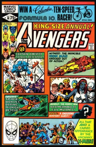
Maybe this is just my personal preference, but I don't like this style! It looks cluttered; there's too much going on. In addition, there's a lot of text on the cover. Lastly, although one of the panels hints at Rogue's first appearance, this issue just misses its opportunity to prominently feature her on its cover. It's a shame its cover didn't look more like the cover of Uncanny X-Men #171.
Marvel Super-Heroes #13: 1st Appearance of Carol Danvers
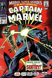
First of all, even though the market has chosen Marvel Super-Heroes #13 to be Carol Danvers' money book, I personally consider MSH #13 to be her first appearance in cameo, as Carol only appears on a couple of panels. She doesn’t appear as Captain Marvel and doesn’t appear on its cover. MSH #13’s cover, instead, prominently features a forgettable character, Sentry. This cover may explain why this book is so inexpensive.
A CGC 6.0 copy, which would be nearly in the top 50% on the CGC Census, recently sold in January for a mere $114. If the cover looked more like the cover of Ms. Marvel #1, I think you'd see a big difference in terms of value.
What are some other key issues that have the ugliest covers? Please let us know in the comments section below!